RUNNING CLOSE TO THE WIND
Mini Brief:
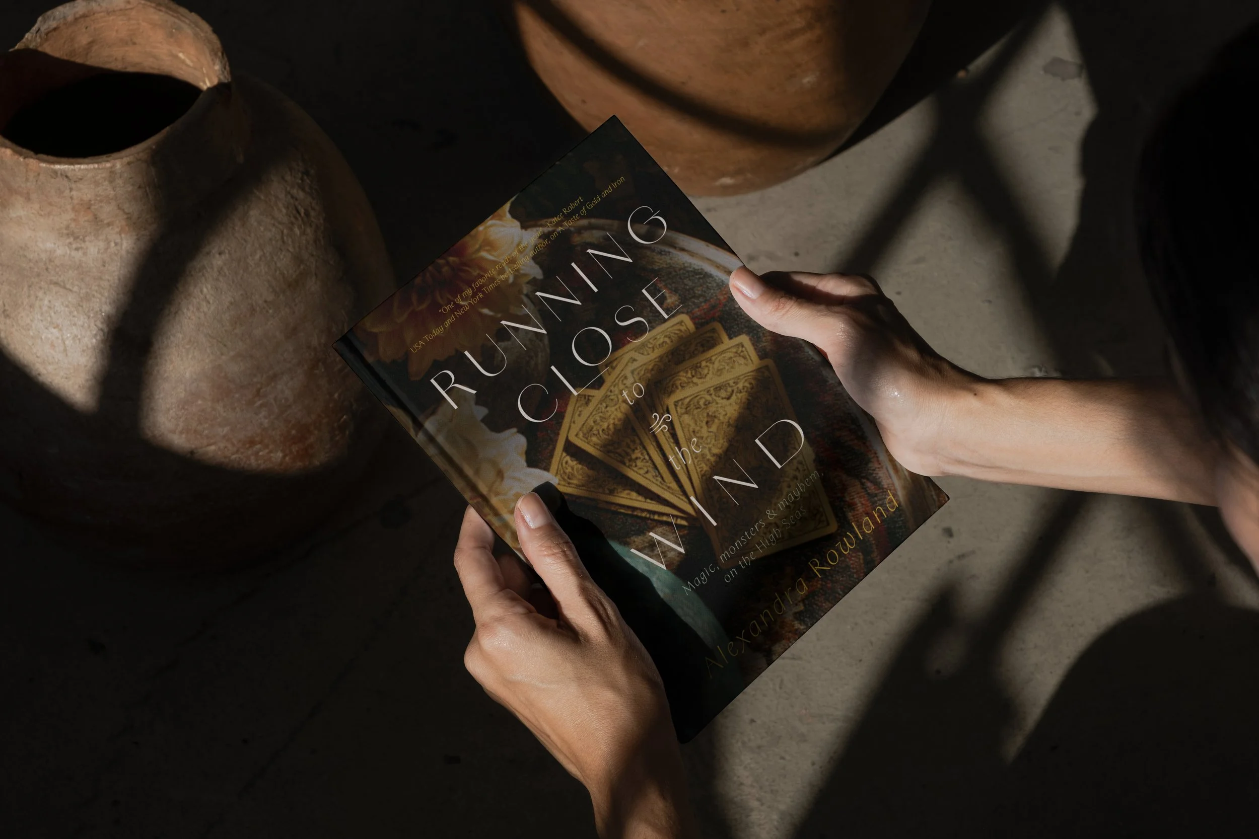
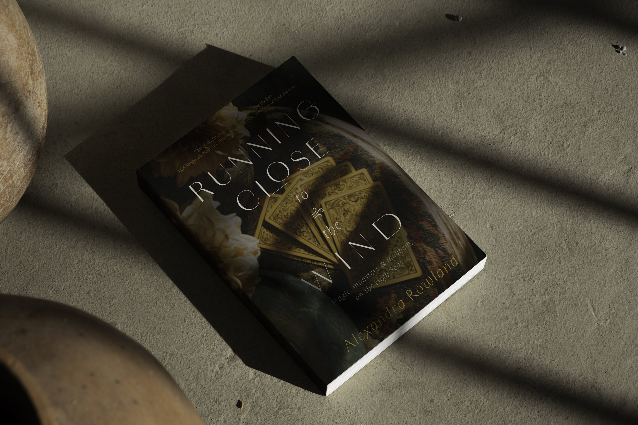
It is true we should not judge a book by its cover, but it is also true that a book’s cover has a duty to represent the magic of the world inside. This is my reimagining of the cover for this witty, sharp, and charming pirate’s tale that is rich with symbolism.
Role: Creative Direction, AI Prompting
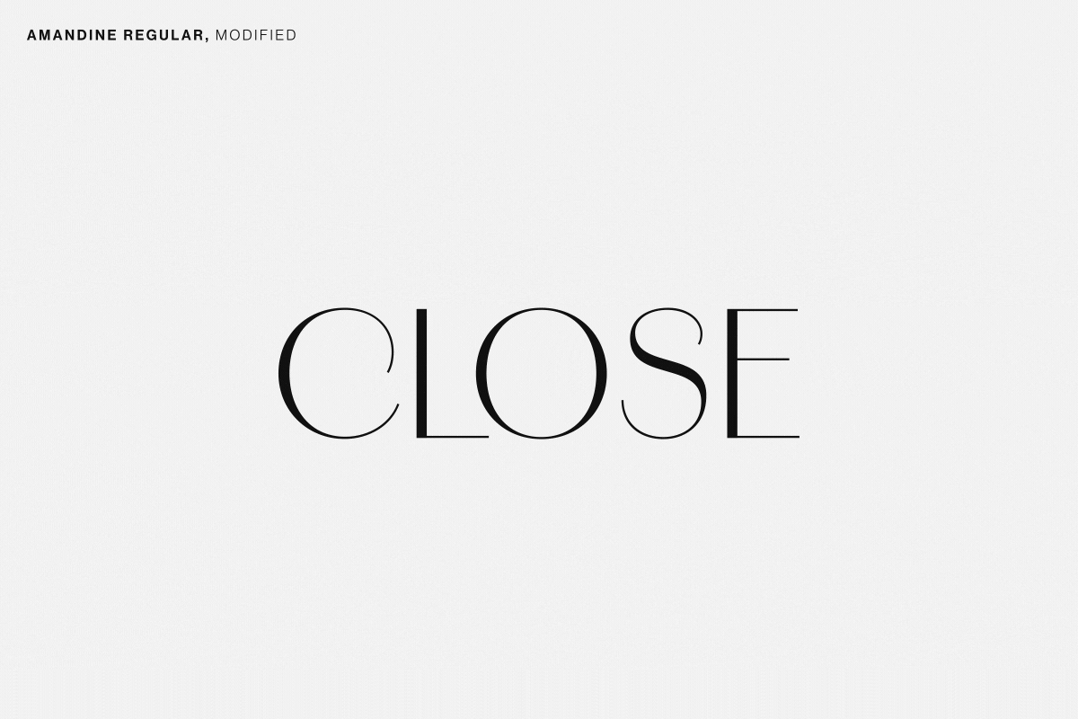
Generous tracking to make space for the fresh, airiness of the wind on the ocean. Extending the L to create connecting and focus. Lifting the O to highlight a quirky hero.
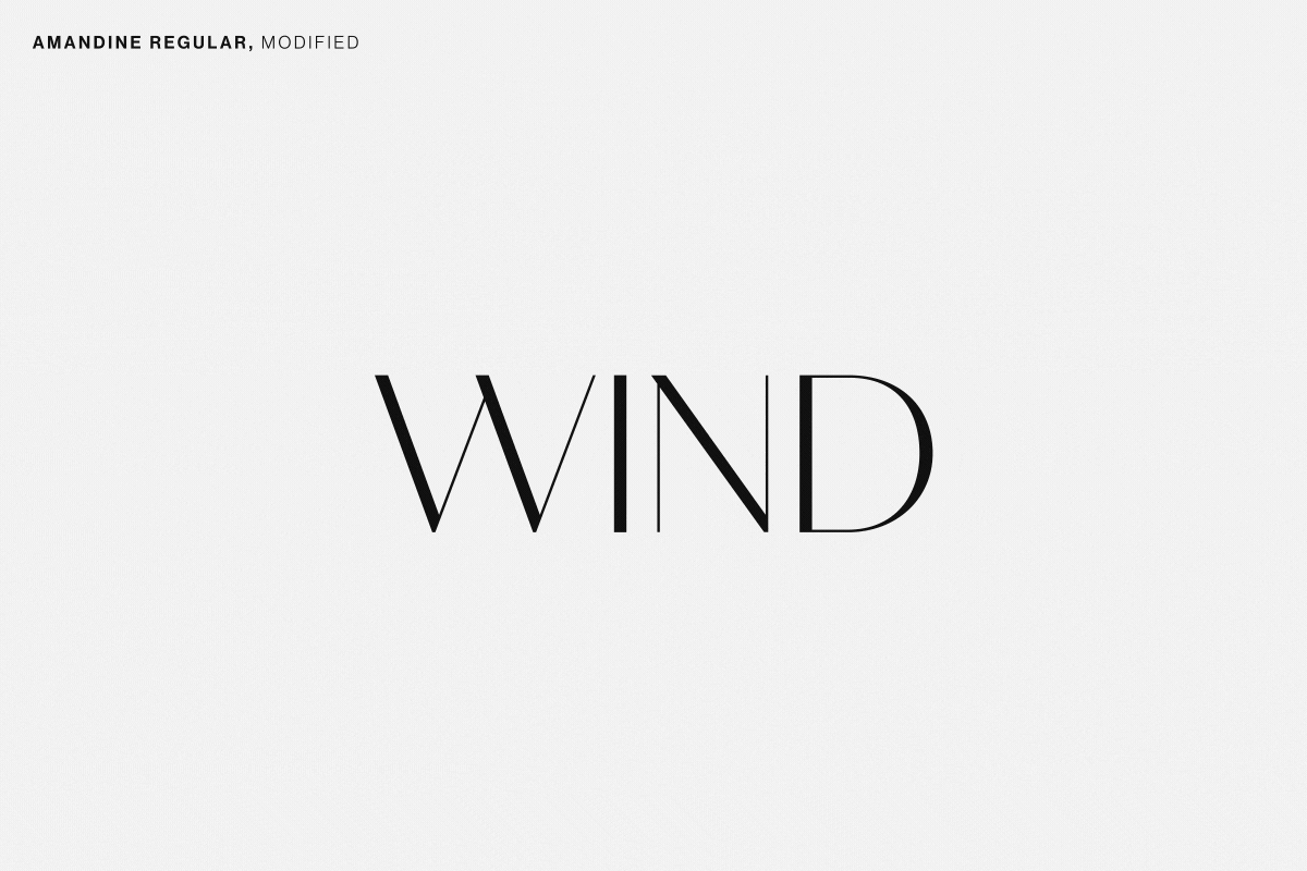
A suggestive extension of the D, to symbolize the triangle of yearning among the main characters.
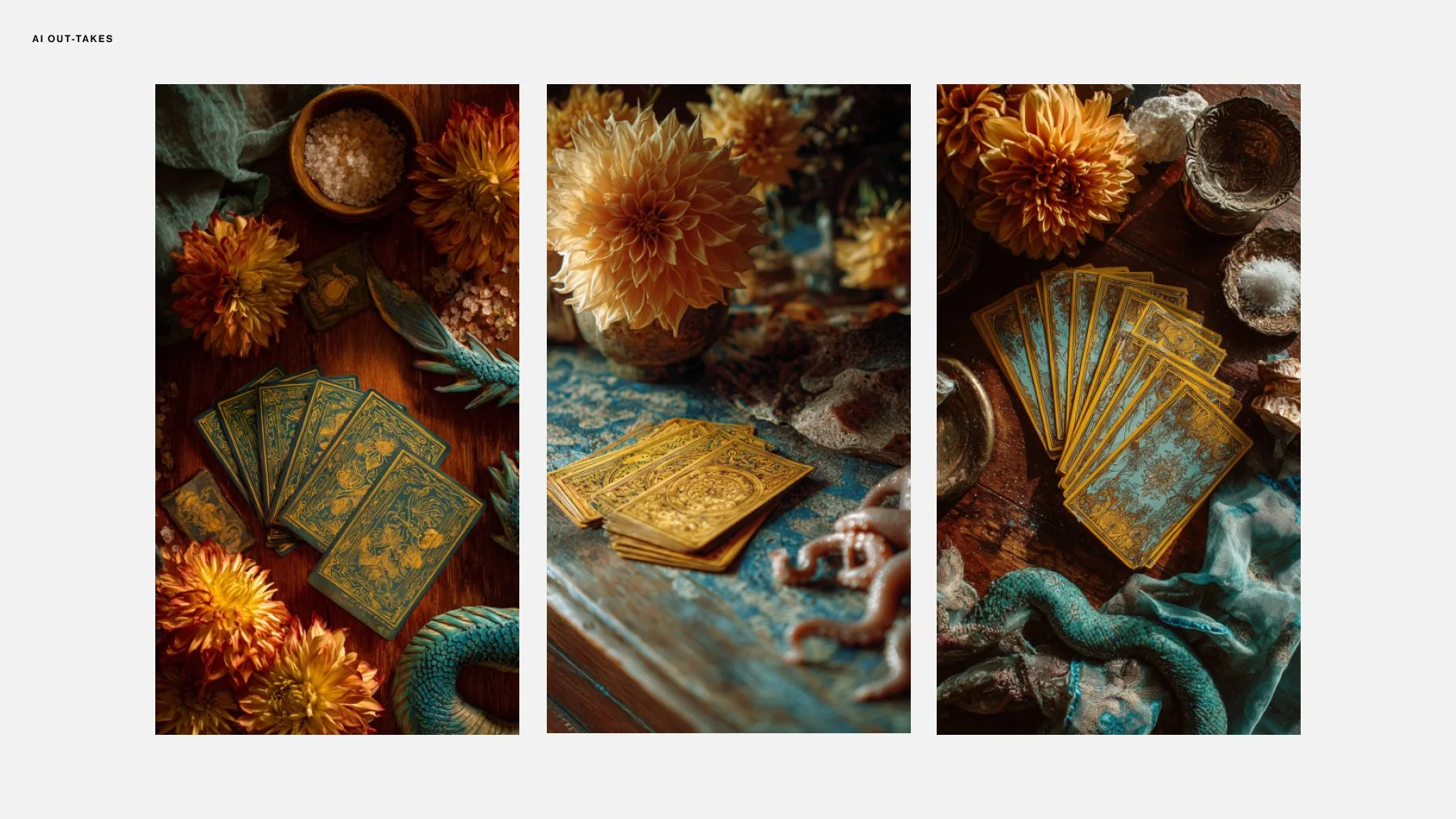
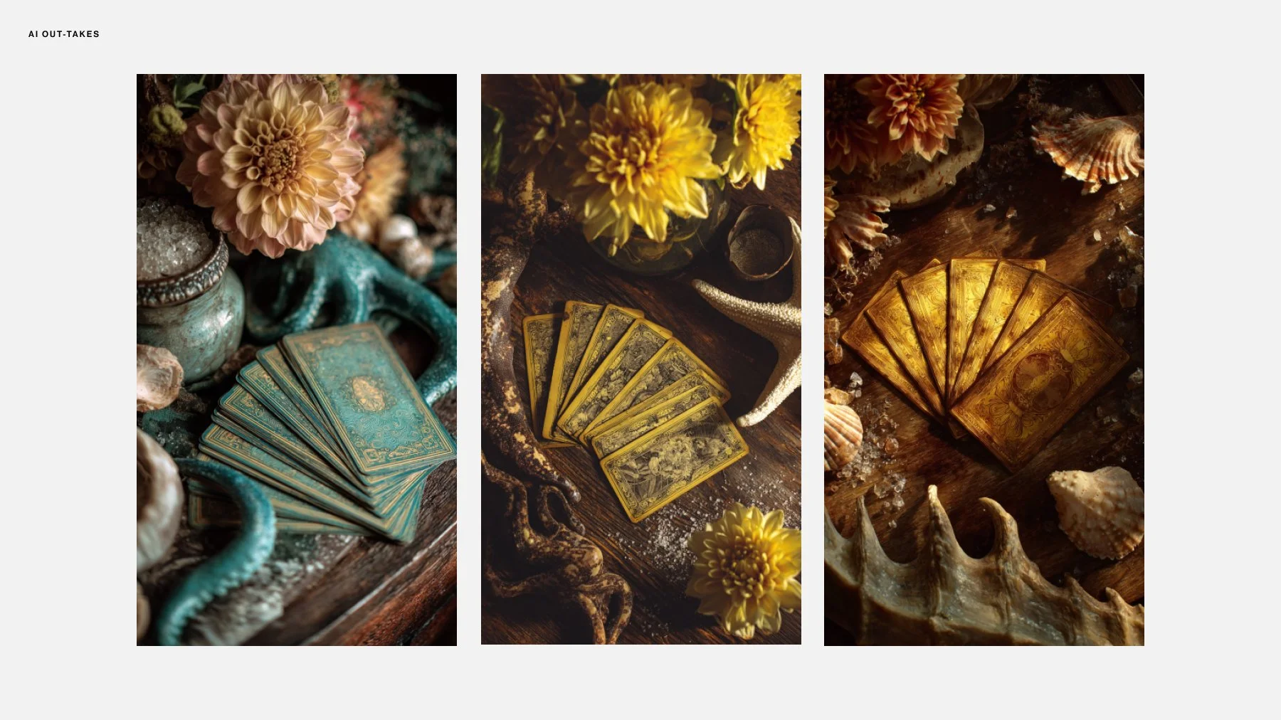
While reading this book, I could not get over how mismatched the cover design felt from the charm, wit, & sharpness of the story. Using generative AI (MidJourney) I quickly visualized the scene I was imagining. A tabletop full of the most powerful symbols from the story – glowing sea serpents, ornate tarot cards, dashing flowers. I tried to get some sea-spray in there, but MidJourney didn’t quite know how to handle that.
The final artwork was refined in Photoshop (lighting, color adjustments, compositional edits), the typographic layout was done in Illustrator, and the whole package composed one final time in Photoshop.
The typographic journey…
